
Transforming Configuration Process with Design 2.0 and User Testing
Low-code platform - User Research & Experience Design
What is the project about?
Evaluate the best tools available today to ensure that the Configurator 2.0 has the finest features and an easy-to-use UI.
To determine design inconsistencies and usability problem areas within the user interface and content areas.
Conduct the usability testing under controlled test conditions with representative users.
Business challenge
The business team wanted to develop a Configurator tool that will be used by Line of Business representatives to build bespoke applications and/or modules internally.
The business vision was to accelerate product development timelines, minimize development expenditures, and enhance product quality to achieve a competitive advantage
Goal of the project
Configurator tool will be used by non-technical Line of Business representatives to build bespoke applications and/or modules internally and maintain apply platform products at scale.
It will exist to increase the speed and efficiency of product development, reduce development cost and produce better quality products.
Tools
Figma
UserZoom
Miro
Team
UX Researcher (me)
Lead UX Designer
Associate UX Designer
Product Leads
Developers
My Role
Competitive Benchmarking
Discovery research – workflow process mapping
User Persona & Task Flow
UX Prototype Design
Heuristics Evaluation of the Designs
Focus-group discussions
Usability testing & user feedback
Recommendations & next steps
Timeline
Overall: 12+ weeks (part of a Lean UX process)
Discovery & Research: 2 weeks
Design iterations: 8 weeks
Test & Iterations: 2 weeks
Lean UX Research & Design Process
Desk Research
Competitor Analysis
Out of several no/low-code platforms available, we identified the popular* competitors the provide variety of features for a no/low-code drag-and-drop interface to develop applications/websites.
*According g2.com, geekflare.com and Google searches
Studying the Existing Process
We organized discovery workshops with client stakeholders and SMEs to learn more about the existing process and pain areas.
This helped us to gain some domain understanding and SOPs for the business case and identify the improvement areas.
Some challenges identified
Manually maintaining the copy books/configuration guides in Excel
Waiting for the developers to build the content system
Inability for users to configure all the content in the application
Content voice can differ between business vs. partner
Some recommendations from desk research
Personalized onboarding when creating a new project with tailored templates basis needs
Live checklist of items that a screen should compulsarily have (e.g., a form needs a Submit button)
Accessibility features to help differently-abled users


Defining User Personas & Task Flow
Defining User Persona
With the insights learnt through discovery research, we defined high level persona to highlight the multiple needs and frustrations of the Line of Business reps. This helped us to brainstorm on our design decisions to prioritize content and interactions.
Revisiting the User Flow
Based on the discovery research, I designed a revised user flow hart to ensure we have accounted for maximum use cases and integrate current functionality as well, e.g., create a new application or maintenance of an existing one etc.


"Currently, we manually update the configuration guide or copy book that defines the colors, schematics, and features of the form for each partner."
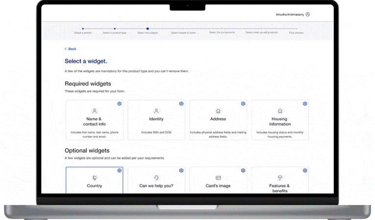
Building Interactive Prototypes
We leveraged the design system as a foundation and applied industry-standard best practices to develop dynamic, interactive prototypes of the no-code platform. By meticulously adhering to the design system's guidelines, we ensured visual consistency and brand alignment throughout the prototypes. Utilizing Figma as our primary design tool, we effectively employed design tokens to streamline the design process and maintain coherence across different screens and components. Through the application of core UX/UI principles such as information hierarchy, user flow, and usability testing, we crafted prototypes that not only met the design system's standards but also prioritized user experience and efficiency.


Conducting UX Review & FGDs with Devs
Heuristics Evaluation
Before talking with potential users, we began assessing the Configurator design concepts, utilizing Heuristics principles to identify usability issues in the interface design.
The heuristics evaluation complies with recognized usability principles.
FGDs with the Devs
Research Goals
Learn about the dev roles, their understanding of the tool, and challenges/constraints.
Determine features they like the most and believe can be improved.
Identify features that may be added to the Configurator tool to improve the overall functionality and experience.
Methodology & Participants
Focus Group Discussions (semi-formal)
Tech leads, UI devs, automation engineers, API backend devs


Usability Testing with the Users
Research Goals
To determine design inconsistencies and usability problem areas within the user interface and content areas
Evaluate user-performance and satisfaction levels of the Configurator 2.0 user interface
Participants
Internal Line of Business representatives
Key decision makers in designing, approving and deploying customer-facing business/product applications
5 participants – Product managers & analysts
User Tasks
Login to the tool and manage the projects (Search, Filter, Edit, Delete)
Create a new application form using the interface
Edit an existing application form
Methodology
Remote Moderated Usability Testing methodology using think aloud protocol
Conducted with InVision prototype links
Participants will be given scenarios and tasks to complete.
Follow-up questions to further explore users’ thoughts and perceptions


"I really like the option to see the live preview of what is being built in real-time."
"These tiles are nice visually, but unneccessary for an administrative tool, because the list is likely to grow."
Findings & Next Steps
Some feedback and findings
Users were puzzled by the Widget icons and expected more data points with sort/filter options in the dashboard
While users liked the minimal UI, they were apprehensive about managing thousands of partners
While managing components, users were overwhelmed by the cards; they should be redesigned to allow for easy widget editing
Live Preview needed to be more prominent and interactive with ability to publish for UAT
The tool should make it easier for users to go to specific sections and keep track of changes
Average System Usability Scale (SUS) score was 70
Some recommendations & next steps
Ability to inherit the predefined partner construct
Allowing reusable templates and XML configs
Ability to automatically generate changelog reports
Introducing user access rights
Allowing custom theming while creating co-branded application forms
Improve designs to adhere to WCAG accessibility guidelines


